2007年5月15日火曜日

Label of Chocolate in Japan


Label fo chocolate usually have gold color. This shows gorgeous looks.

Label of Griko, Confectionery Company

When Griko puts its first caramel on the market, all of the other confectionary makers used yellow packaging for their caramels in imitation of their predecessor, Morinaga. There was not one red package to be seen on the market. Riichi Ezaki looked forward to the day when he could outstrip the big predecessor. Dislike imitaion, he thought of something which would best attract people's attention and at the same timestimulate the appetite, and finally came up with a red package. (Ezaki Glico. 1979)

2007年5月10日木曜日

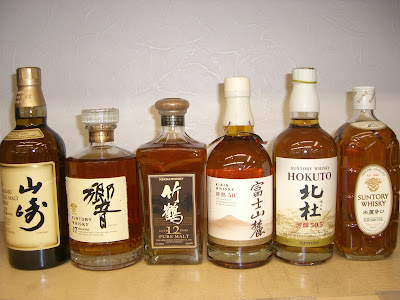
Label of Japanese Whisky written in Kanji

To know about the reason why these whiskeis from SUNTRY have kanji letter, I called SUNTRY and asked this question but the answer was so vague. Actually she and workers didn't know the reason but she said it's sure that they don't classify by price. However these are designed and named by the person who creates. I couldn't have contact with these designers. She said usually these names are decided by process and whiskey's image.
For example "山崎-Yamazaki-" is named to represent the location of main SUNTRY distillery, Yamazaki and Yamazaki is famous for pure and clean water. So Yamazaki also indicates this is made of Yamazaki water.
"響-hibiki-" is made by image that echo throughout water.
This is just my opinion they use kanji when they could have made a whiskey which can be liked by all over the world and say that Japanese whiskey tastes good.

Label of Foreign Whisky

Each visual element such as shape, material style of lettering on label and coloring reflects the character of the country in which the liquor was made. (Shigeshi Omori. 1979)
Country: From left
Scotland, France, America, America

Country: From left
America, America, America, Scotland, America(Distiller is from germany)


What is written on Burbon Label


"White Horse"
On this back, explanation of process is written in Japanese and this message is translated to Japanese. Because this is important to make buyer to know process, effort and ambition to this whiskey.


"Jack Daniel's"
In this case process is written in English and besides almost all labels are written in English, maybe this is because to keep image of Jack Daniel's. However Japanese can recognize only design and name. Normally they don't try to read English letters. However from my point of view buyer usually feel American thing from this label. Maybe it's the same as the tendency that many Japanese people like to listen to American music without knowing the meaning of lyrics.

"WILD TURKEY"
The poem written on this is also not translated in Japanese.

Label of Japanese Sake: what it's like

History of Sake Label:

The development of Nada sake in the Tokugawa period was based on the transportation of the sake to Edo by ship. Some picture in those days shows ships loaded with a number of barrels with marks written in sumi for purpose of distinction. They are considered to be origin of labels of sake.(Hoji Kino. 1979)


From left: Yuyu(Faraway), Shinkame(Tortoise of God) , Tosaduru(Crane in Tosa), Tsukasabotan(National tree peony), Kamoduru(Crane in Kamo).

All are nihonshu and written in Kanji.

- Yuyu is written by ink brush. However this is rather art than the word. The designer wrote like this to show the image of this sake.


- Shinkame is also like art and actually we can see “神” means god and usually kanji of tortoise is “亀”. “亀” is written in artistic style. We can’t recognize without hiragana or katakana letter which explain kanji letter.


- Tosaduru is written in standard ink brush style. However this label has picture of rice which represents nihonshu is made of rice. Also this has katakana to explain how to read kanji.

- Tsukasbotan is also written in ink brush and many tree peonies are written on the label. Also center circle is like silhouette of tree peony. We can see katakana on upper label to explain how to read kanji.

- Kamotsuru has many kinds of letter, kanji, katakana and English letter and also picture of Mt. Fuji which means the best highest in Japan. The reason this label has many kinds of letter is that in 1896 kamotsuru was transported in the U.S. and in 1900 was also transported in Paris so they put roman letters to make all over the world recognize. (The Kamotsuru Sake Brewing Company. 2006)

The reason Tosatsuru and Shinkame has katakana is only for fashion.
I don’t think that nihonshu labels always have to have kanji or hiragana because even if they are written in katakana, which is born in Japan and Japanese letter. It’s enough to represent Japan. Also I feel that nihonshu which is sold in the world need to have some English words to be global. However the name must be written in kanji letter or hiragana letter.


From left: Kofukurou(Little owl), Kannoko(the River of God), Tantakatan(Mt.Tantaka), Kyou no Hikari and Shiranami(White Wave).

They are all shochu.

-Kofukurou has hiragana letter in ink brush style with gold color and picture of little owl. This is like art and so fashionable.

-Kannoko has English poems they have a deep meaning but usually they can be just a ornament because normally Japanese people can't read and don't care about them.


-Tantakatan has difficult kanji which we hardly use and beautiful picture which represents the Japanese folk story named Tantakatan. (OENON 2007) This picture is drawn by imaging this story.


-Hikari has simple hiragana letter and picture of geisha which represent Kyoto.


-Shiranami has kanji letter and picture of wave and moon. We can see strong impact of sea from picture.


Usually these label name and design is created by a producer who made sake and by image of sake.

2007年4月15日日曜日

Label of Foreign Confection


My opinion that I looked at foreign labels for first time was that they have deep colors and strong impression. They really different from Japanese labels like paper quality, style, colors, etc.

2007年4月12日木曜日

Label of Sake


These whiskies are made by a company, SUNTORY. These labels are written in all English except for one label. There are many kinds of bottle style. Bottles in the middle picture are miniture bottles, about 100ml.
I think the reason why these labels are written in English is that whiskey came from foreign country so image of whisky is probably foreign style.


These whiskies are from foreign country. By comparing to Japanese whisky, there are some analogy. Each bottle style is unique and label is written in English. I feel Japanese whisky company borrows these styles to keep image of whisky.


One of unique bottles made by SANTORY.


They are nihonshu and shochu. Nihonshu and shochu are traditional sake in Japan. All of these are written in kanji and hiragana like a Japanese-style confection. Almost all of these labels are written with writing blush-style font. Bottle styles are generally the same: 1.8L, 900ml and 720ml are general bottle style.
Although it depends on a company, the back of nihonshu usually has information which includes the process of making, introduction of how to drink, company name, method of preservation and message which says that the age under 20 must not drink and please recycle this bottle. Although some nihonshu labels don't have information on the back, they do have necessary information like ingredients, on the front label.


They are nihonshu bottles and are sold for people who want to drink little like beer cans. The capacity is from 180ml to 720ml.


They are shochu. The bottle of shochu have many styles, even if it was the same commodity. The first shochu to the left has earthen ware-style bottle, Toki bottle in Japanese. It shows Japanese tradition.

They are unique bottles. The left thing is a sake barrel. The right one is a sake bottle which represents a zodiac sign or animal sign. They are nihonshu and mainly sold on January to congratulate a New Year.


2007年4月11日水曜日

Label of Snacks


These snacks, Koara No March, Pockey, and Meiji Milk Chocolate are very common in Japan. The label has not changed for few decades.. They have a simple label style which only has the name of the snack written on it.
On the back of the packaging, the following information can be found: The advertising slogan, campaign, general name, ingrediants, weight, storage instructions, company name and its address, website address, information which specific ingrediants are made from the company's branches, and introductions of how to provide feedback or make complaints if the product is found faulty/unsatisfactory - there is a lot of written information.
In general, bar code is put on where we can't see in the face of package. I mean it is written on the back or side.
What is unique about the advertising on these sweets/snacks compared to Japanese-style confection is the title which is written both in katakana and English.


These are Japanese-style confection, Senbei and Surume made from squid. The label of Senbei has a bold design, which has gold coloring. The back of the packaging has the same content as the snacks above. Labelling of Surume is simple. A particular feature of the label is that it is written in kanji and hiragana with writing brush-style font.


Sakuma Drop is also a famous product in Japan. In the can, there are many candies with a variety of fruit flavours. This type of confectionary has been sold for a long time, it is rare that candy is sold in this style of packaging these days. Confectionary is sold usually wrapped in a bag-type package.

This is a chocolate from Morinaga. This is like image of melting chocholate. The reason this label uses gold color is to be looked gorgeous. Also this label is so simple that only has commodity name and company logo. This simpleness makes this look gorgeous.